 Anna Harrison
In 2011, GoDaddy lost 72,000 customers in one month. What can we learn from the evolution of the GoDaddy brand, and the importance and impact of the first impression that we make with our site visitors?
The challenge
Founded in 1997, GoDaddy spent the first decade as the infamous, cringe-worthy brand associated with risqué marketing tactics featuring a trademarked GoDaddy Girl®. Perhaps a brilliant strategy for early growth, the approach nevertheless alienated a large part of the potential target audience, and certainly presented a blocker to customer loyalty. In a 2011 Harvard Business Review case study, the authors describe the tenuous nature of GoDaddy’s brand love, as evidenced by a mass exodus of 72,000 customers in the course of one month. Although popular, the brand was tolerated rather than loved.
The approach
The customer revolt in 2011 happened around the same time as a private equity injection of capital into the business. With that, came the expected mandate to scale and grow – and thus began a decade long evolution of the vibe, visuals and value proposition of the brand.
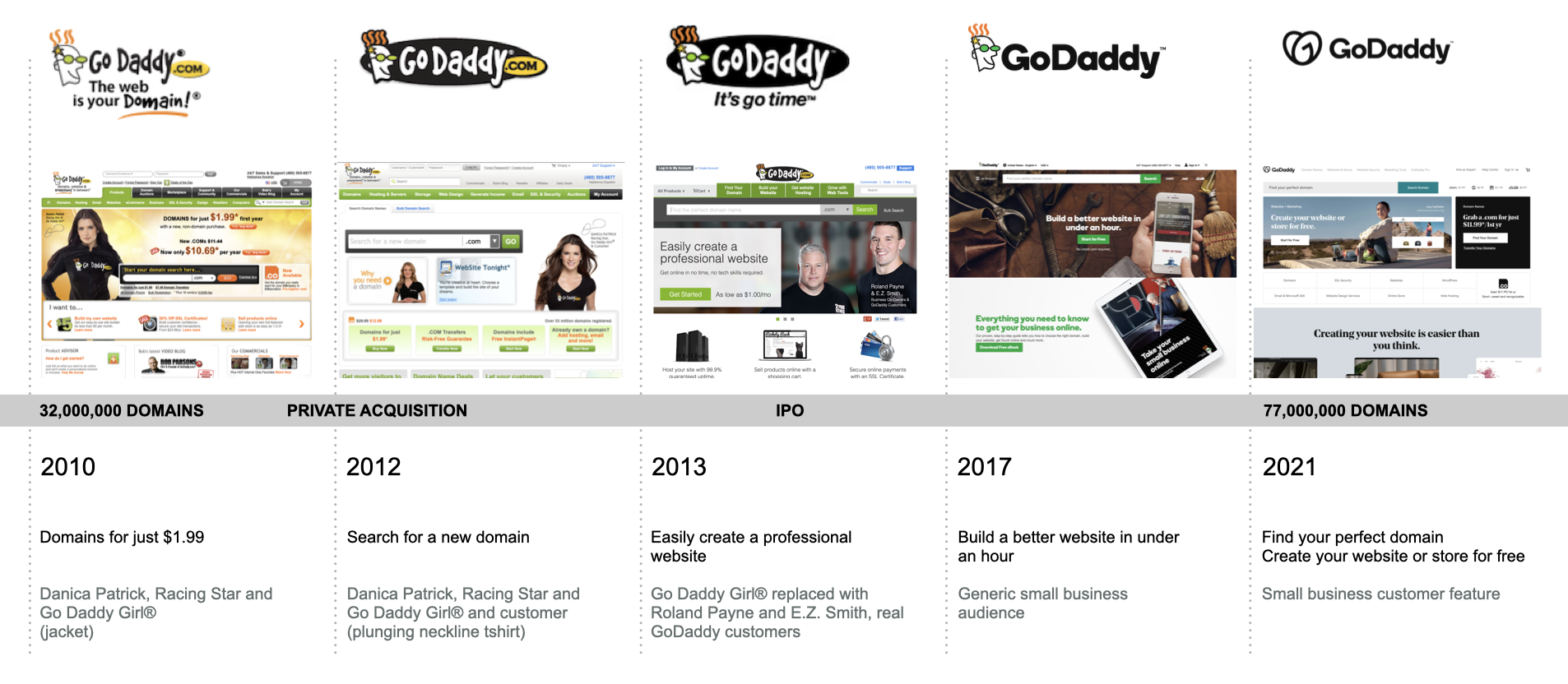
In 2010, the value proposition of GoDaddy was focussed on their core business, “Domains for $1.99”, endorsed by a jacket clad GoDaddy Girl®. The brand’s logo looked visually unchanged since 2001: the “quirky” (some say creepy) dude with green glasses continued to promise “hot” prices. The visuals start to change gradually in the next year, with 2012 seeing a transition in messaging to “searching for a domain”, departing from the focus on “hot” pricing and cheap domains. While the GoDaddy Girl® is now also customer, and the words take a step away from “hotness”, we continue to witness ever plunging necklines and raunchy Super Bowl ads featuring the GoDaddy Girl®. The mixed messaging confuses the public, with the general opinion of the brand reported as “Eyyyyyyeh”, somewhere between indifference and distaste.
A new CEO enters the scene, and with that, leads the brand to a new maturity. By 2013, the messaging changes significantly: GoDaddy is now the place to “Easily create a professional website”. GoDaddy Girl ® is retired and replaced by very ordinary and relatable small business blokes, Roland Payne and E.Z Smith.
GoDaddy IPOs in 2015. By 2017, the brand has become almost generic in terms of the visual identity but remains focussed in their messaging “Build a better website in under an hour”. The creepy mascot is dropped from the logo around 2018, and the business is now squarely focussed on appealing to a much larger small business market.
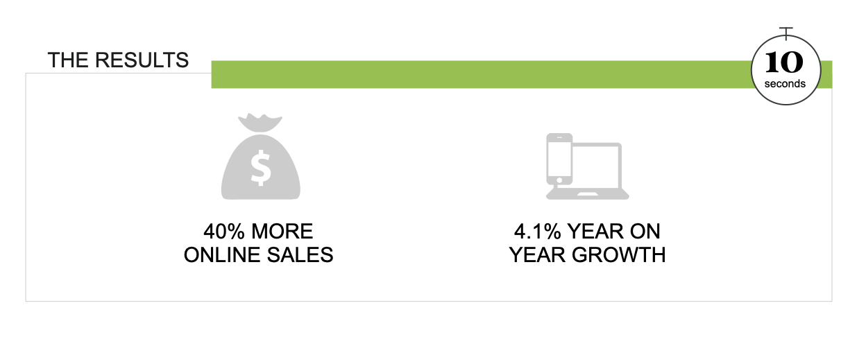
In 2020, GoDaddy re-launches their logo – loved by some, criticised by others as being a close copy to that of AirBnB. While differences of opinion abound regarding the design aesthetic, the brand successfully completes the transition from tasteless and alienating, to professional and helpful. GoDaddy becomes a brand that is loved by over 19.3 million customers around the globe, reflecting 11.5% revenue growth between 2019 and 2020, and a 40% increase in ecommerce sales.
Why it worked
The evolution of the GoDaddy brand image and message worked for several reasons:
- Over a period of ten years, the updated visuals changed the vibe of the first impression from tacky to trustworthy, creating an increasing sense of credibility through updated fonts, colours, messaging and use of imagery.
- The shift away from using “sex” to sell, to speaking to ways in which GoDaddy could make life better for customers dramatically improved the ability for the brand to be related to, and loved, by a larger target audience.
- The updated visuals made it easier for site visitors to get to know GoDaddy. While cheap tricks and clickbait headlines do drive traffic, the traffic is often shallow and does not lead to meaningful engagement. Featuring relatable small business owners and an updated brand image opens the door to discovery and removes resistance from the first impression.
Apply it in your business
If your brand is losing business to competing firms, and you notice that the time on site for your website is relatively low, you can improve your chances of success by investing in your Ten Second milestone in three easy ways:
- Check that your brand looks visually credible. If your styling is outdated, invest in a brand refresh.
- Check that your value proposition is clear. If it is not super obvious how you will make your site visitor’s life better, there is worthwhile work to be done
- Check that your page headline (or value proposition) matches the copy on the referring website or ad. For example, suppose your site visitor clicked on a link for “setting up an ecommerce store” and landed on a page about “cheap domain names”. The disconnect introduced by different copy may disorient your site visitor and cause them to leave.