 Anna Harrison
The challenge for PocketSmith 90% of paying customers were active in the first month after signing up, 44% of customers were inactive in the second, and were therefore more likely to churn. The opportunity cost of these churned customers was high. Learn how PocketSmith turned this around
The challenge
PocketSmith is a fast-growing fintech focused on helping individuals manage their finances. The PocketSmith team had great systems and measures and prided themselves on being objective and data-driven in their product development. They knew that they had nailed their marketing, their brand identity and style resonated with their target audience and their product was loved by the customers who made it through their onboarding process. The challenge for them was that while 90% of paying customers were active in the first month after signing up, 44% of customers were inactive in the second, and were therefore more likely to churn. The opportunity cost of these churned customers was high.
The approach
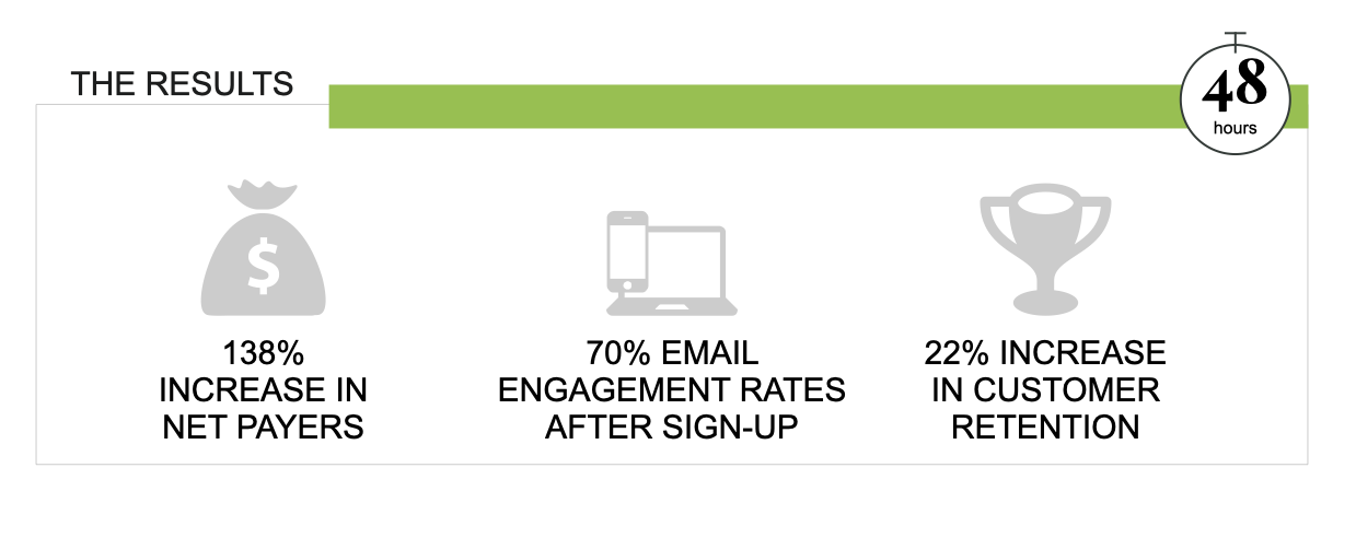
PocketSmith targeted their product to an audience that they describe as “makers”. A cohort of intelligent, curious and expansive creators who loved learning new things. The team was attracting the right audience to their website and could not figure out why many were losing interest right after the Sign-up milestone. They expanded their educational material, upped the volume of blogs and information resources, and still had no tangible shifts in the after Sign-up churn rates. Their breakthrough came when the team realised that although their audience loved learning, the onboarding process was not the right time to engage in this education. So instead of educating, they shifted their focus to enabling – removing all resistance from the onboarding process, both in-app and in their email marketing campaigns in the week after Sign-up. Their first email was rewritten as a short and friendly welcome message, which was then followed by an email with a succinct quick start guide to help with onboarding. As a result, more users engaged with the onboarding email - from 58%, to consistently over 70%.
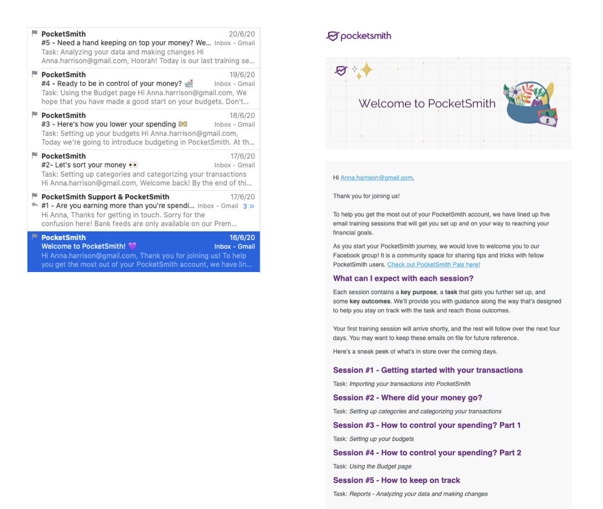
PocketSmith’s original emails invited newly signed-up users to engage in “five email training sessions”. Taking away the heaviness of this workload increased engagement rates
The team identified another source of churn, which correlated to a billing quirk in their system. The backend system that processed payments was queuing transactions and processing them in batch. This resulted in a 24-hour delay between upgrades to a paid plan, allowing some users to downgrade to free before the charge. The team made changes to process payments for new subscriptions instantly, resulting in an increase in conversion rates from 30% to 37%.
We can infer from this that having some skin in the game encourages users to stick around to invest the time in managing their money!
Jason Leong, CEO PocketSmith
A third refinement was an update to the billing emails notifying a customer that their payment details needed to be updated. While they technically worked, the designs of the emails still reflected PocketSmith's old brand. When this was updated, along with clearer subject lines and copy stating the reason for the payment did not go through, the team saw a 22% increase in customer re-subscriptions.
These customers were letting their PocketSmith subscriptions lapse simply because the messaging did not inspire trust and had insufficient information – not because they did not love the PocketSmith product.
Why it worked
The changes made by PocketSmith in the customer journey for the First 48 Hours after Sign-up worked as they directly triggered a number of decision short-cuts. Simplifying the language used in the onboarding emails took away the perception that getting started with PocketSmith would be hard and require training. Removing obstacles made the desired behaviour easier for the new customers.
The immediacy of billing had a positive effect on retention for two main reasons. The first is that it closed the deal on ownership – seeing a charge to your card plus an acknowledgement in your inbox provides a sense of urgency to get started using the tool you have subscribed to. Once customers began using PocketSmith, completed onboarding and got their first win, they were highly likely to continue using PocketSmith. The second reason this change worked is that there was a direct connection between the payment and the need to use the tool now.
Updating the copy in the emails from “training sessions” to “easy steps” immediately lightened the perceived load of completing the onboarding process. This was a more complex issue to identify, as at face value, the target audience were people who loved learning. The misconception was that they wanted an education during the onboarding process. When reverting to first principles about buying behaviours (Part I), the team formed the hypothesis that they were failing to the power of inertia. Decoupling the two journeys, namely onboarding and education, simplified the perception of engaging with PocketSmith.
Apply it in your business
To improve your First 48 Hours retention rates, look for the following signals and opportunities in your business:
- Find the moment after the Sign-up milestone where you are losing your audience. The easiest way to do this is to set up a simple observational user test – I guarantee that the few hours you invest in this will pay dividends. Use the worksheets in this chapter to get started.
- Create a short path to the first win after the Sign-up milestone. This is important as it confirms for your customer that you are as you promised, i.e. easy to work with and easy to use.
- Start with your points of failure
- Overlay the points of perceived value
- Draw a straight line to connect there
- If your product is “complex”, use sensible defaults in the onboarding process to shorten the path to the first win
- Remember that you don’t have to provide a short path to every win – you only need a short path to one win.
- f your product is complex, engage a great UX designer to help you deconstruct your onboarding process into a lighter touch sequence, making use of sensible defaults. Remember that your onboarding does not have to get your user started with every feature you offer – only with a small set of the most valuable features. The rest can be configured with subsequent onboarding sequences as needed.