 Anna Harrison
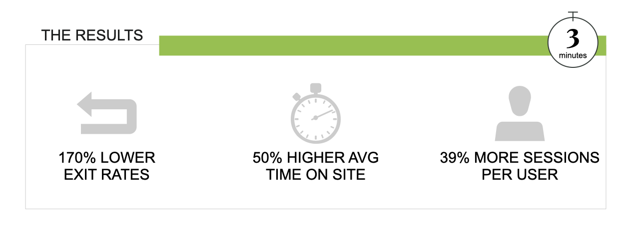
We are only seeing an exit rate of 27% compared to 47% on our website conversion page, meaning users are more informed to convert -- Hayden Foster, CEO NextMinute
The challenge
NextMinute is a SaaS job management product suite for mid-sized construction firms such as builders, plumbers, electricians and tilers. NextMinute was growing rapidly and looking to refine their go to market strategy in Australia. The sales team had excellent sales conversion rates from the demo session - the challenge facing the team was how to convince more site visitors to sign up for these sessions. The sales team also noted that they spent a lot of time explaining the offering and pricing model to prospective clients.
The approach
An analysis of the NextMinute website revealed four areas for improvement:
- Refining the value proposition
- Refining the brand style guide
- Refining the order in which information was presented on each page, and
- Simplifying the pricing model
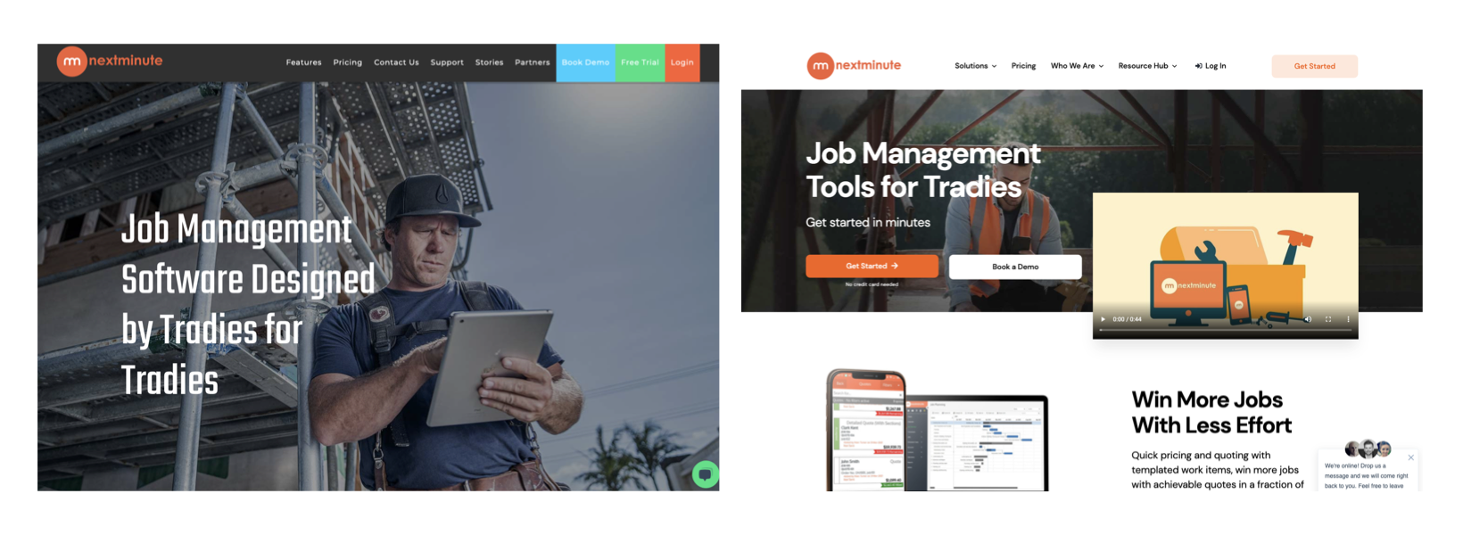
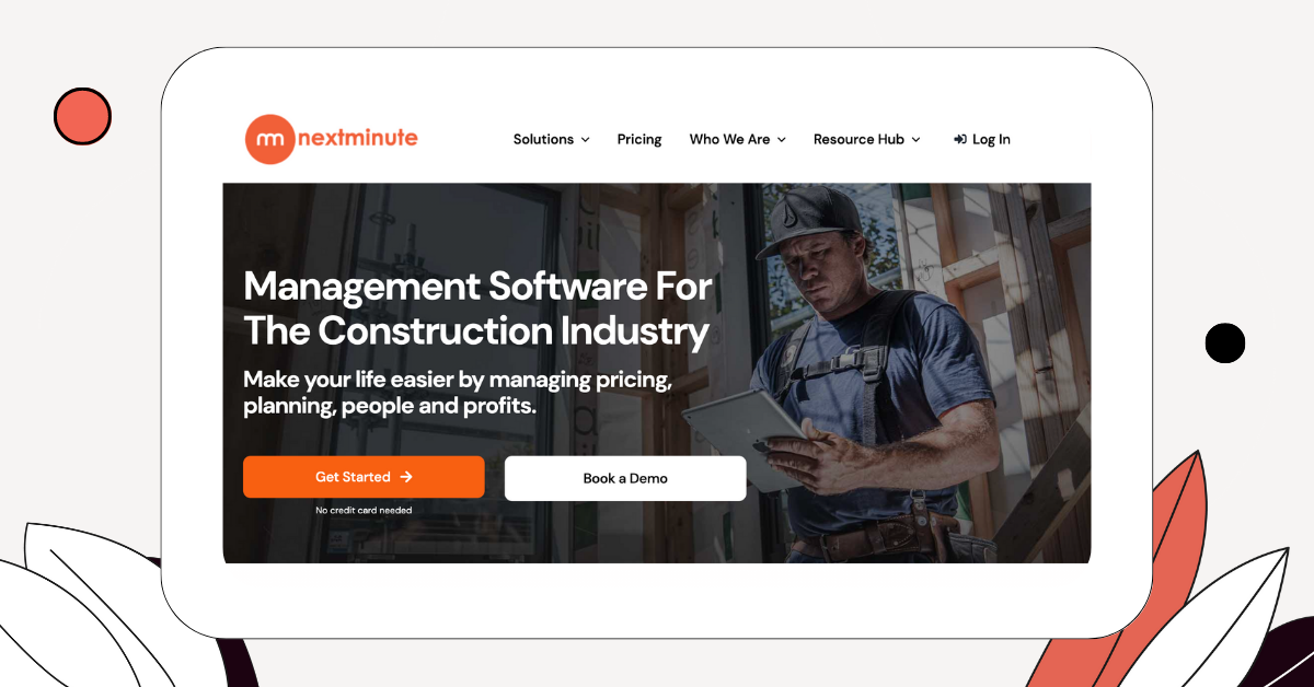
The original webpage hero led with the value proposition “Job management software designed by tradies (contractors) for tradies” and had three equally weighted CTA buttons in the top navigation bar. There were no further CTAs below the value proposition. Unfortunately, the equal weighting on the three CTAs provided no guidance as to which action the site visitor should take – the need to make a decision introduced a tiny but real moment of resistance.
The hero section layout and copy were changed to reflect the main reason why high-value customers were using the brand, that being ease of use. Loyal brand advocates often spoke of how much easier NextMinute was to use and engage with than larger competitors. The new hero section copy was updated to “Job management tools for Tradies. Get started in minutes”. This was coupled with a primary CTA to “Get started”, with an anxiety-reducing “No credit card needed” below the button. A secondary CTA to book a demo was introduced. The buttons in the top navigation bar were removed, leaving only a single CTA to “Get Started”. Introducing a clear visual hierarchy in these CTAs removed the resistance of having to stop and make a decision.
The brand style guide was updated to include the visual hierarchy for CTA buttons on the site. A modern colour palette and font selection were chosen. The original imagery was retained as it showed real and relatable images of NextMinute’s customers using the product in the field.
The information presented on the home and landing pages was re-ordered in line with the recommendations in the home page templates (which you can download at the end of this chapter). The pricing model was also simplified – removing the “calculator” and introducing two clear, explained options which delineated between “admin users” (bookkeepers or business owners) and “mobile users” (contractors working on jobs).
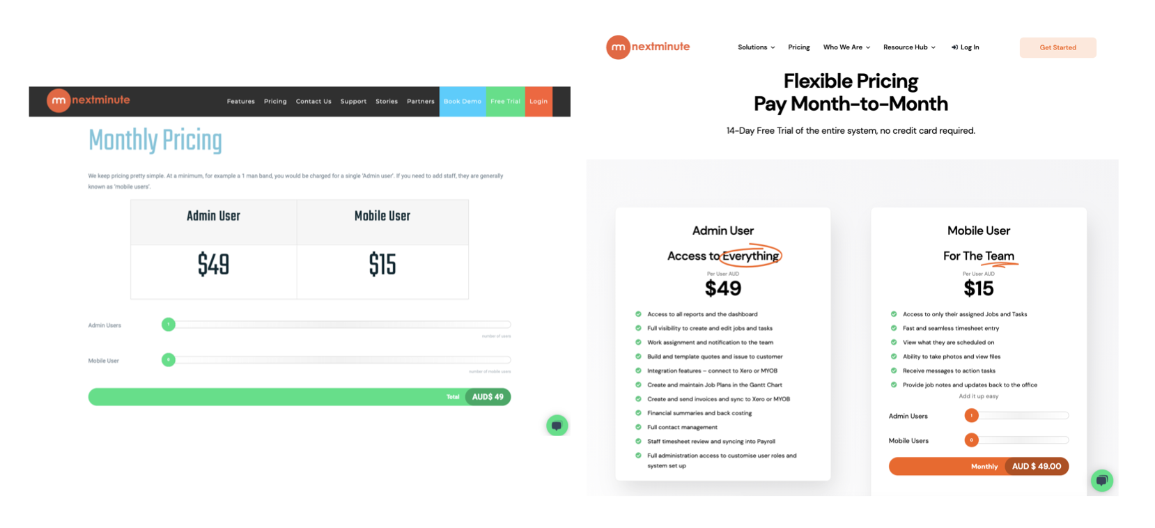
The old pricing page created confusion as site visitors could not immediately understand what Admin and Mobile users were. The updated page made the distinction clear, removing blockers and increasing demo booking rates
Why it worked
The changes made to the NextMinute website are an excellent example of how the six ADORE steps can be used together to create stronger brand buyer relationships. Identifying the four main areas that were below optimal levels (value proposition, styling, page layouts and pricing model) allowed the team to make relatively simple changes to the website, which resulted in immediate and significant improvements to the performance of their prime digital asset.
Our website is now properly aligned with what our visitors are looking for and presented in a way that leads them down the right path of education and qualification. On top of this, ADORE has given us the framework to create and distribute new content that fits with this journey which we can then use to generate more traffic through SEO and social distribution
Hayden Foster, CEO NextMinute
The changes made worked for the following reasons:
- The new value proposition provided a hook that resonated with the main reason customers loved NextMinute: ease of use. Removing the words “designed for tradies by tradies” sharpened the focus on what was important. Fewer words in the hero equal more impact, as they reduce the cognitive load in that first few seconds of orientation for a new site visitor. The change resulted in 170% lower exit rates from the website.
- Introducing a visual hierarchy for the CTAs had the immediate effect of reducing cognitive load, and at the same time, directing the site visitor towards the desired action. The changes resulted in a 50% increase in average time on site, indicating that site visitors were more interested and engaged.
- Changing the order in which information was displayed on the key pages improved the unfolding of the NextMinute brand story, resulting in site visitors becoming more engaged as they understood what the offer was and how it would make their life better. These changes resulted in a 39% increase in the number of sessions per user, and the average session per user increased by 200%. These repeat visits cumulatively increase the site visitor's commitment to NextMinute, activating the consistency decision short-cut.
- The last change, simplifying the pricing model, reduced the cognitive load and burden previously placed on the site visitor in having to think hard to figure it out. The change was effective as it activated several core decision short-cuts, FREE, relative comparison and the removal of obstacles. The change has increased the number of demo bookings and reduced the callers' confusion around the NextMinute model.
We are only seeing an exit rate of 27% compared to 47% on our website conversion page, meaning users are more informed to convert
Hayden Foster, CEO NextMinute
Apply it in your business
If you are reviewing your marketing strategy and considering expanding your sales and marketing team with new hires, use the ADORE Process to first analyze your existing digital footprint. You may still find that the new hires are justified, but in optimising the flow of site visitors into more committed phases of your customer journey, you will be releasing your new hires to focus on closing deals rather than answering basic questions about how your offering works.
Look for the signs that your website may need a tune-up at the Three Minute milestone. If you notice low return visit rates and low time on site, it is a good indication that applying the strategies that NextMinute used will help to increase your conversion rates to the next milestone, Sign-up. In particular:
- Review the order in which you reveal your brand's story, paying attention to the cadence at which you invite the site visitor into forming a relationship with your brand
- Remove friction by making it easier for your site visitor to choose the action you want them to take
- Review your value proposition and styling, as it will impact the previous two points due to the visual nature of interactions in the digital space